How to Win More Clients with Your Freelance Website and Do Less Marketing

When you have a professional and client-focused website, you’ll get more steady, high-paying clients with less marketing—because your freelance website will do the work for you. So you won’t have to actively “sell yourself,” the part of marketing that freelancers hate most.
But you need to grab the attention of clients in 15 seconds or less. One study found that people spend about 50 milliseconds (0.05 second) deciding whether they and will stay on or leave a website. Other experts say you have up to 15 seconds, which still isn’t very long.
Of users who stay on a website more than 15 seconds, 38% of people will click off if the content or layout aren’t attractive.
Your Client-Focused Freelance Website

Whether you’re creating your first freelance website or updating your website, focus on the needs of your clients and how you help them meet their needs. Quickly tell clients:
- What you do (your services)
- Who you do it for (your target clients)
- How what you do benefits clients.
If you already have a freelance website, it might be time for an update. Website design and content change. And most freelance businesses evolve over time.
Free Guide
The Ultimate Guide to an Awesome Freelance Website
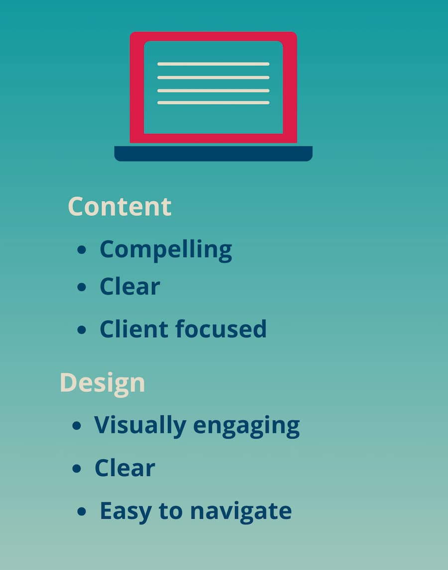
Write Compelling, Client-Focused Content
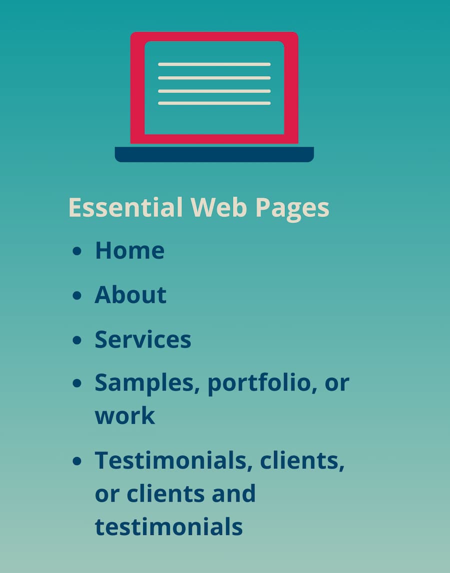
Use client-focused marketing messages, include the essential web pages for freelancers, and write conversational, concise, and scannable content. If you already have a client-focused LinkedIn profile, then you should have much of the information you need for your web content.
Compel Clients with Key Messages
Client-focused marketing messages focus on the needs of the clients you work with or want to work with and how you can meet their needs. Common general client needs include:
- Get more business or make more money (usually by selling more products or services)
- Help their clients get more business
- Be seen as a thought leader
- Educate and inform people
- Stay on budget and on deadline.
Clients also have freelancer-specific, target market, industry, and company needs. Learn more about client needs.
Use your banner heads, banner subheads, blurbs (brief descriptions), and other subheads to highlight the benefits clients get when they work with you. A banner is the horizontal bar near the top of every web page on many modern website designs.
Include the Essential Freelance Website Pages
 You can combine and organize Services; Portfolio, Samples, or Work; and Testimonials, Clients, or Testimonials and Clients in different ways. I cover this below.
Awesome Freelance Website Checklist
Click here for your free checklist for your website content, writing, and design.
Your Home Page
Together, your Home page content and design quickly answer the only question that clients really care about: What’s In It For Me? Your Home page tells them:
- What you do (your services)
- Who you do it for (your target clients)
- How what you do benefits clients.
You’ll draft your Home page last. But you should be thinking about your Home page as you write the rest of your content.
A compelling, client-focused freelance website Home page includes:
- A header banner with your key message and a subhead (or blurb)
- Images that contribute to your key messages (or no images)
- Shortcut boxes
- A clear call to action with your contact information.
A banner is a great way to highlight your key message on your Home page and quickly tell clients what they want to know. It supports both client-focused content and engaging design. The banner on your Home page is usually bigger than the banner on the other pages.
Make sure that any image you include in your banner is relevant and that your key message is clear. Freelance writers and editors often have banner images that obscure their key message, because they’re not designers. Sometimes the images they use make no sense.
Either of these problems will drive clients away—in less than the blink of an eye. Hiring a professional designer will prevent this problem.
Logos and a banner are relevant, effective images for a freelancer’s Home page. A logo is a visual way to represent your business. A tagline is a memorable phrase or sentence that helps your target clients understand what you do.
Learn More about Logos and Taglines
Stand Out in a Sea of Freelancers: Your Brand
If you don’t have a logo and want one, your web designer should be able to help you develop one or refer you to a designer who specializes in logo design.
Use Shortcut Boxes
Home page shortcut boxes add more visual appeal to a website and let you highlight key content quickly. Each shortcut box is linked to a page on your website. You can use up to about 30 characters (with spaces) in the headline of a shortcut box and up to about 115 characters (with spaces) in each blurb.
Include Contact Information
Make it easy for clients to contact you with a clear call to action, your contact information, and a link to your Contact page. A call to action says what you want clients to do, for example, “Call or email me today.” The bar at the bottom of your Home page (and every page) is a great place for your call to action and contact information.
About
Start the About page with one to three sentences about how the client would benefit by working with you. Then, briefly include the most relevant (to clients) information about your:
- Experience
- Education
- Awards and honors
- Other professional accomplishments.
If you want to provide more information, link to a subpage with your resume or a longer bio.
Include a professional headshot.
Services
Services is an easy page to write. Select categories based on the type of work you do and use bulleted lists for services under each category. Sample categories could include:
- Services (e.g., writing, editing, consulting, publication management, and training)
- Projects (e.g., articles, blogs, continuing medical education, white papers, newsletters, social media, and web content)
- Areas of expertise, topic areas, or therapeutic areas (e.g., cardiovascular disease, cancer, diabetes; banking and financial planning).
Samples, Portfolio, or Work
This is another easy page to write. If you have samples you can share, use categories that make it easy for clients to find what they’re most interested in. Also use categories that let you highlight the type of work you most want to do.
If your work is proprietary, instead of samples, use a project list and/or brief project descriptions to show what you’ve done. Write about what you’ve done and the type of clients you work with without mentioning names of clients or specific projects.
If you’re a new freelancer, put a little information about your work on your Services page instead of having a separate page for this. Add a few paragraphs with some project descriptions and/or use samples like:
- LinkedIn articles
- Volunteer work for professional associations
- School projects
- Spec samples (a speculative sample that’s like a project you want to work on).
Clients and Testimonials
The Clients content is also easy to develop. Choose categories that let you highlight your most important services and interests, such as industries or types of work. Or just list your clients. Using a partial list of clients, under a subhead Sample Clients or Select Clients is a good idea.
If you’re a new freelancer, you won’t have a Clients page yet. That’s fine. Add it when you’re ready. If you only have a few clients, instead of a separate page, add a Sample Clients section on your Services page.
What others say about you is far more powerful than what you say about yourself. Testimonials from satisfied clients help you attract more clients—because new clients want to know that other clients value your work.
Testimonials are an easy, proven way to build trust with clients who don’t know you yet.
Learn More About Testimonials for Your Freelance Website
Testimonials: The Simple Way to Make Clients Trust You
You can combine Testimonials with Clients on one page, have two separate pages, or sprinkle testimonials throughout your website.
If you’re a new freelancer, you won’t have testimonials, or enough testimonials for a separate page yet. If you have one to three testimonials, sprinkle them throughout your website. Add a Testimonials page when you have about five testimonials.
Contact Information
Make it easy for clients to get in touch with you with contact information that’s easy to find. Use a simple Contact page, not a contact form. Include your name, email address, and phone number. I recommend that you also include your city and state, to help show that you’re running a real business.
Start your Contact page with a call to action (what you want the client to do). A call to action starts with a phrase or sentence that urges the prospect to take action now, like “Contact me today.”
And include your email address (or email address and phone number) on every page. The bottom of each page is a great place for this.
Write for the Web
Writing web content is very different than other types of writing. Web users:
- Scan, reading only 20%-28% of the average web page
- Stay on an average page less than a minute
- Often stay on a web page 10 seconds or less.
So if clients don’t find what they need on your website fast, they’ll leave—and move on to the next freelancer on their list.
Be Conversational, Concise, and Scannable
Along with compelling, clear, and client-focused content, you need to:
- Write like you’re having a conversation with someone.
- Put your key marketing messages and other important information first.
- Be concise.
- Use banners, heads, and subheads to make your content scannable and help convey your key marketing messages.
- Keep paragraphs short and sentences simple. On the Web, a one-sentence paragraph is fine.
- Use simple, familiar words that your target clients understand.
- Avoid jargon, and avoid or limit acronyms and abbreviations.
- Use the active voice and lots of verbs.
- Use bulleted lists, where appropriate.
Highlight Your Freelance Website Content with a Professional Design
If your design isn’t visually engaging, clear, and easy to navigate, then compelling content won’t help you. Clients will move on to the other freelancers on their list without reading your content.
And the truth is, many websites of freelance writers and editors look awful!
These websites look like they were designed by an amateur—because they were. Templates in drag-and-drop website builders like Squarespace, Weebly, or Wix make it seem like it’s very easy to design your own website. But if you don’t have knowledge of good design and the technical ability to adapt templates to a freelancer’s needs, your website will be amateurish.
Hire a professional designer. It’s one of the best investments in your freelance business you can make.
Look for tips on website design, and how to find and work with a professional designer, in future Mighty Marketer posts.
Use Your Freelance Website to Market Your Business
After you launch or revamp your website, put your URL on all marketing materials, including your:
- Email signature
- LinkedIn profile
- Business cards.
Including your website on your LinkedIn profile is very effective. A client who’s reading your profile is just one click away from your website. Make sure you put your URL under Contact info in your introduction card and again in About.

Learn More About Your Freelance Website
FREE GUIDE: The Ultimate Guide to an Awesome Freelance Website
FREE TOOL: Awesome Freelance Website Checklist