How Kathleen Labonge Boosts Awareness with her Freelance Brand
 Kathleen’s freelance brand boosts awareness of her services, gives her more confidence, and makes freelance marketing less uncomfortable and more effective. Here’s how Kathleen developed her freelance brand.
Kathleen Labonge, MBA, wanted clients to easily understand her freelance services and consider her company, Write Point Editing Solutions, a bona fide business. By developing a freelance brand, the freelance medical copyeditor was able to achieve these goals and more.
“My brand communicates a lot of information at a glance. Clients/prospects don’t have to guess what I’m about,” says Kathleen, who launched her freelance business in 2015 and developed her brand about two years later. Kathleen provides expert medical editing for health care professional and lay audiences, helping clients produce accurate, clear, and consistent content.

More Awareness Makes Freelance Marketing Easier
Along with boosting awareness of her services, Kathleen’s freelance brand boosts her confidence and makes freelance marketing less uncomfortable and more effective. “My brand messages are clearly conveyed and consistent, making it easy for prospects to make an association in their minds about what I do,” she says.
As Kathleen has seen, a strong freelance brand helps her stand out in a sea of freelancers.
A Clear, Simple Brand Boosts Awareness
Developing a brand statement gave Kathleen the foundation for a clear, simple brand. A freelancer’s brand statement defines:
- What you offer: Services
- Who you offer it to: Target audience(s)
- How you’re different or better than other freelancers.
Target audiences are the types of clients you work with.
Here’s Kathleen’s brand statement:
“Medical communication and education companies, hospitals, medical practices, health care and health-related organizations, and other clients can count on me for accurate, clear, and consistent medical editing.”
Parts of Kathleen’s Brand Statement
Kathleen’s key service is medical editing. Her target audiences are medical communication and education companies, hospitals, medical practices, health care and health-related organizations, and other clients.
Clients often see freelancers as the same or similar to each other. So Kathleen clearly differentiates herself from other freelance editors as a problem solver who focuses on the details so the client doesn’t have to do this.
All editors focus on the details, so this isn’t actually unique. But by using “I focus on the details so you don’t have to” as her tagline, Kathleen is positioning herself as different and better. A tagline is a memorable phrase or sentence that helps your target audience(s) understand what you do.
A Confident, Bold, and Enthusiastic Brand Boosts Awareness
Kathleen’s brand also includes her company name, tone of voice, colors, and logo with her tagline.
As Kathleen started thinking about her brand, she chose a confident, bold, and enthusiastic tone of voice. She also started thinking about things that she associated with editing, and collected ideas.
“I wanted to be seen as a business that offered answers/solutions/help to clients, hence the ‘Editing Solutions’ part of my business name. And I always knew I wanted to incorporate a pen in my logo,” says Kathleen.
Kathleen also researched colors, logos, brand ideas, etc., online. She bookmarked articles and images, and also saved things on Pinterest boards.
A freelance brand has 2 or 3 colors:
- Dominant color
- Secondary color
- Accent color (optional).
Dark blue (dominant color), red (secondary color), and teal (accent color) are Kathleen’s brand colors. Kathleen had seen dark blue and teal together in her son’s college colors and liked them.
“As I got serious about designing my logo and website, I realized the colors I chose were appropriate for my type of business, so I kept them,” says Kathleen. Dark blue shows confidence, strength, and dependability. Teal, a blend of blue and green, is connected with health. And it’s one of Kathleen’s favorite colors.
Kathleen made red her secondary color after I suggested it as a color associated with editing. The red is bold and grabs attention, creating a sense of urgency.
A Professionally Designed Brand Boosts Awareness
Next, Kathleen hired a professional designer to implement her brand and boost awareness of her freelance business. She worked with my designer, Brian Corchiolo, owner of bpc creative.
Brian developed Kathleen’s logo and website. If you don’t have a website yet, I recommend that you develop your logo first so you can use it on your website. A logo is an image, symbol, or other design to identify a company’s services. Together, the logo and tagline are the main way you show your brand.
Brian and Kathleen chatted on the phone about what Kathleen was looking for in her logo and website. “I told Brian I wanted something simple and professional, nothing flashy,” says Kathleen. “I asked some questions, and we formulated an agreeable working plan.” She sent Brian everything she had been collecting, including her tagline, and the colors she wanted to use. Kathleen told Brian that she wanted to use a pen in her logo.
Kathleen’s Logo Concepts
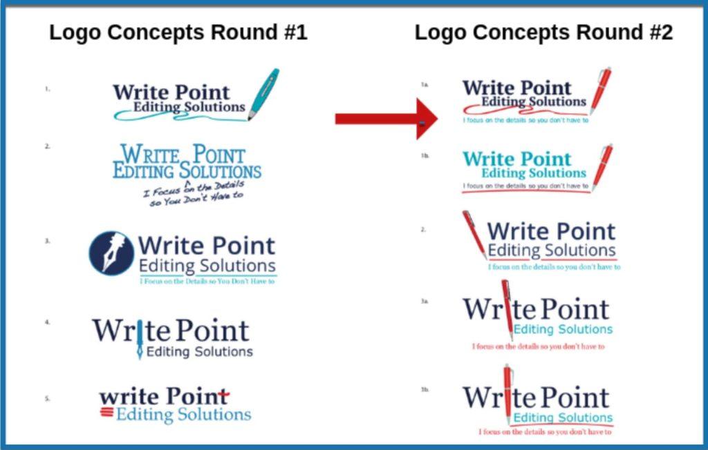
Next, Brian developed some logo concepts for Kathleen to review. Those initial concepts were very different from Kathleen’s final logo. “Initially I wanted a fountain pen. But Lori and my designer said it was old-fashioned,” she says.
Brian did design a few concepts with a fountain pen, but Kathleen quickly saw that a more modern pen worked better. Kathleen reviewed the concepts, and sent them to me for review too. I suggested making the pen red, the traditional color of editing pens.
“The pen got much sleeker looking during the logo design process. And we tried different lines between the company name and my tagline,” says Kathleen.
Here are the first and second rounds of logo concepts.

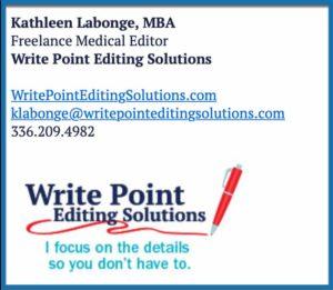
About a year after developing her freelance brand, Kathleen decided to do a slightly different version of her logo for her email signature. She had Brian divide her tagline into two lines, so it’s easier to read in an email.
Here’s what Kathleen’s email signature logo looks like.

An Honest and Trusting Design Process
During the logo design process, Kathleen learned that it was okay to continue to tweak her logo until she was satisfied with it. “We would go back and forth and Brian would come up with options. We’d work through them.”
And Brian didn’t mind this. “Kathleen was honest about what she liked and didn’t like. That enabled me to develop a logo for her that reflects her business,” says Brian. Not being honest is one of the biggest mistakes that freelancers make when working with Brian.
“My logo is eye-catching and memorable,” says Kathleen. “I like the consistent message it conveys.”

Learn More About Freelance Brands
Kathleen’s Brand
From The Mighty Marketer
Stand Out in a Sea of Freelancers: Your Brand
Do You Know the Best Way to Develop an Awesome Freelance Brand?
How DeLene Stands Out with her Freelance Brand
The Innovative Way Margaret Attracts the Right Clients
How Eva Stabenow Attracts the Right Clients with her Freelance Brand
How Kristin Harper Shows She’s a Professional with Her Freelance Brand
11 Steps to a Business Name that Will Make You Memorable
How to Win High-Paying Clients with Your Freelance Website